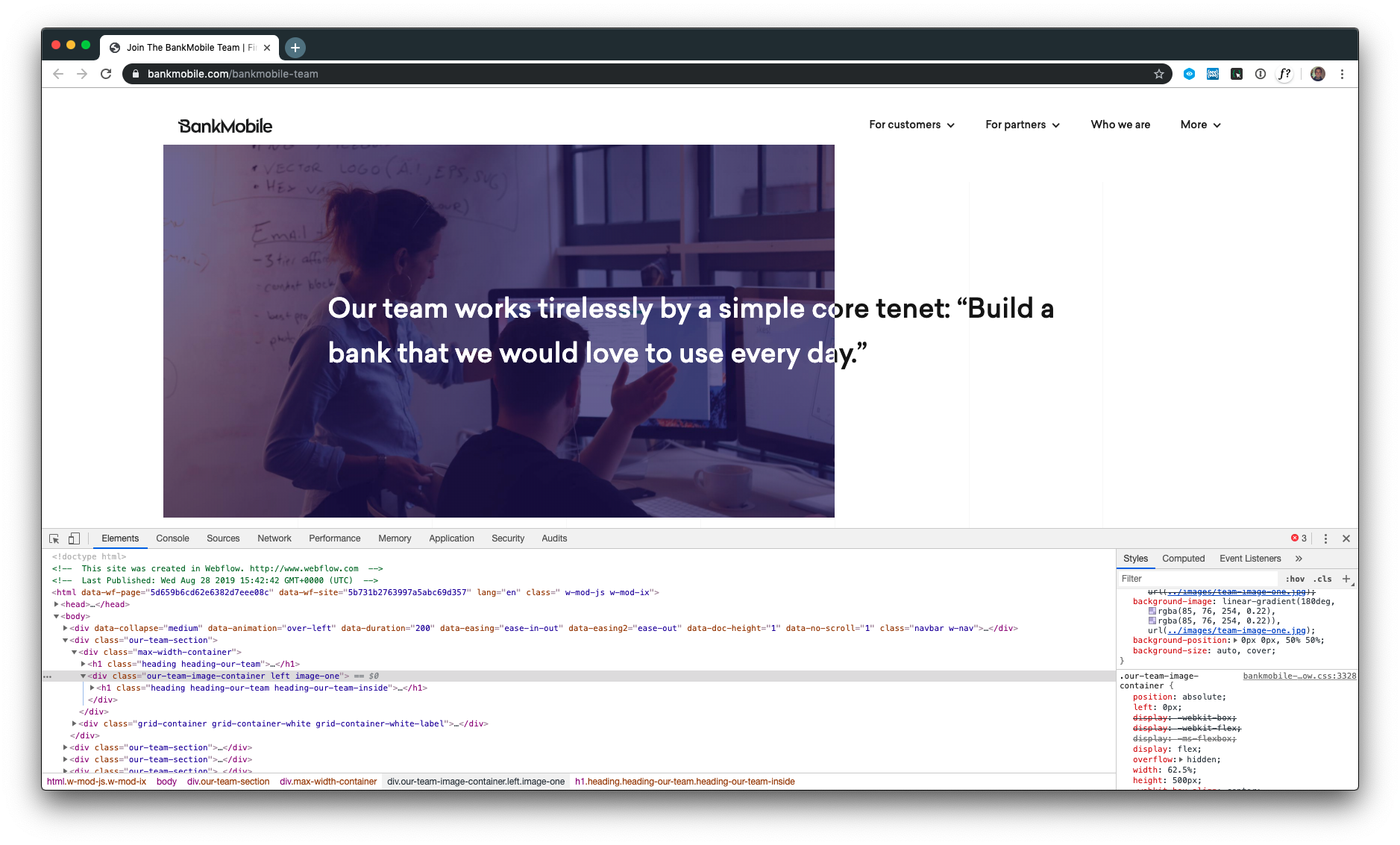
The above illustration is a pretty cool trick to over lap text with an image and still maintain mixed contrast. It's even responsive. Here is the logic that makes it work:
<h1 class="heading heading-our-team">Our team works tirelessly by a simple core tenet: “Build a bank that we would love to use every day.”</h1>

<div class="our-team-image-container left image-one">
    <h1 class="heading heading-our-team heading-our-team-inside">Our team works tirelessly by a simple core tenet: “Build a bank that we would love to use every day.”</h1>
</div>
.our-team-image-container {
position: absolute;
left: 0px;
display: -webkit-box;
display: -webkit-flex;
display: -ms-flexbox;
display: flex;
overflow: hidden;
width: 62.5%;
height: 500px;
-webkit-box-align: center;
-webkit-align-items: center;
-ms-flex-align: center;
align-items: center;
background-color: #554cfe;
}This places the image on top of the black heading but cuts off the child heading. What's cool is that the text lines up so cleanly. Even with different window sizes.
Check it out for yourself: Bank Moble